So, were you inspired by the Olympic athletes? It’s amazing to watch so many athletes perform at their very best on the world’s biggest stage. The spectacular gold medal events caught our eyes, but there was also an advertisement that stuck out.
Omega did a beautiful job here; it almost makes you want to buy an Omega watch. But if you think about it that’s what good design should do. It should captivate the viewer’s attention and make a memorable impression. So, that got us thinking about good design for websites which lead us to explore current web design practices that are out there. We created a list of 7 web design practices we love that won’t be going anywhere anytime soon.
Video
Starting off our list is video. A video is a great way to make a good impression on your visitor. Also, having a video on your website has these benefits:
- Increase website traffic
- Engage visitors
- Improve search rankings
- Increase conversion rates
Now, let’s talk about where the video might end up on your website and the best practices.
Home Page
If you’re thinking about putting a video on your homepage, make sure it’s a short video clip that loops. You don’t want a crazy large file because this will lead to loading problems and lower your SEO score. If you’re using the video as a background for your text, just make sure it’s readable throughout the video.
About Page
A video on your about page is a great way to engage your visitors, especially when you want to connect with them on a human level. This is a great opportunity to share your organization’s personality or to show what goes on behind the scenes. A video can be a more friendly and inviting way to connect with your audience, especially when there are faces to connect to the brand.
Customer Story
Think of customer reviews but in video format. Nowadays, most businesses have customer reviews, so why not go the extra mile, and showcase your customers and how you helped them achieve results. This is a great way to further add authenticity and trustworthiness to your reviews and your brand.
Comfortable Colors
Next, on our list is comfortable colors. Now, we have nothing against bold and bright colors but as developers and designers who are always looking at computer screens, it’s a nice break to look at a website that’s easier on the eyes. Also, we’ve learned that Zoom fatigue is a thing, so why not focus on color schemes that won’t strain our eyes. Most of these color schemes will naturally induce calm and relaxation, which will further enhance the visitor’s experience. It’s a win-win!
Animation
Let’s move on to animation. From moving images to hover effects, you can find some sort of animation on a website. Now, like all design practices, you can overdo it and overwhelm your visitors. Incorporating animation in your design should increase usability. For example, hover effects are great guiding tools to help people understand buttons and where to click. You can also use animation to communicate a message and create an emotional connection to the visitors. The animation should add to the visitor’s experience and not distract or take away from other design elements.
Thumb Friendly
So, this next trend is going away from visual design and going into the area of functional design. It’s focusing on mobile sites that are friendly to the thumbs. We’ve all been here, holding our phone with one hand and then having to fumble around because our thumb can’t hit a certain button. Now, most mobile sites will be designed for right-handed people since that’s most of the population. Here’s a diagram to illustrate what we’re describing.
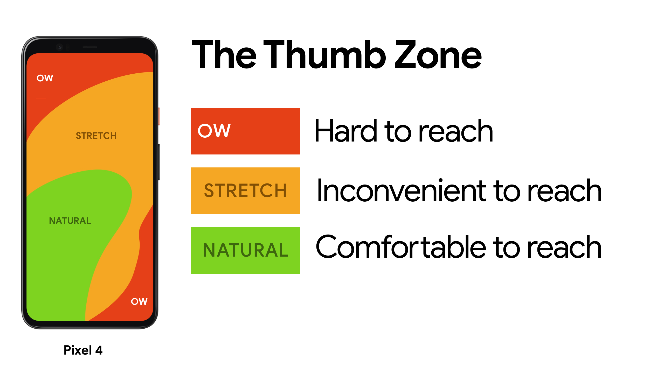
Let’s use Instagram as our example. All the buttons are easily accessible for the thumb. There are no buttons on the left side of the screen, except the bottom which is easily accessible. It was a little annoying at first when they added the swipe feature, but now it feels second nature. Phones aren’t going anyway and will only keep getting more advanced, so that’s why thumb-friendly design made this list.
Accessibility
To continue with functional design is accessibility. This means designing for everyone in mind, especially those with disabilities. Examples of this would be making sure the text is easy to read for all, not relying on colors, and labeling forms clearly.
High Contrast & Colors
Incorporate high contrast to your designs, so those with visual impairments can more easily read your text. There is this great tool that measures the contrast ratio of colors. Along the same line, don’t rely too much on colors to convey meaning. Those who have color blindness may not be able to distinguish the message and it won’t be accessible to them at all.
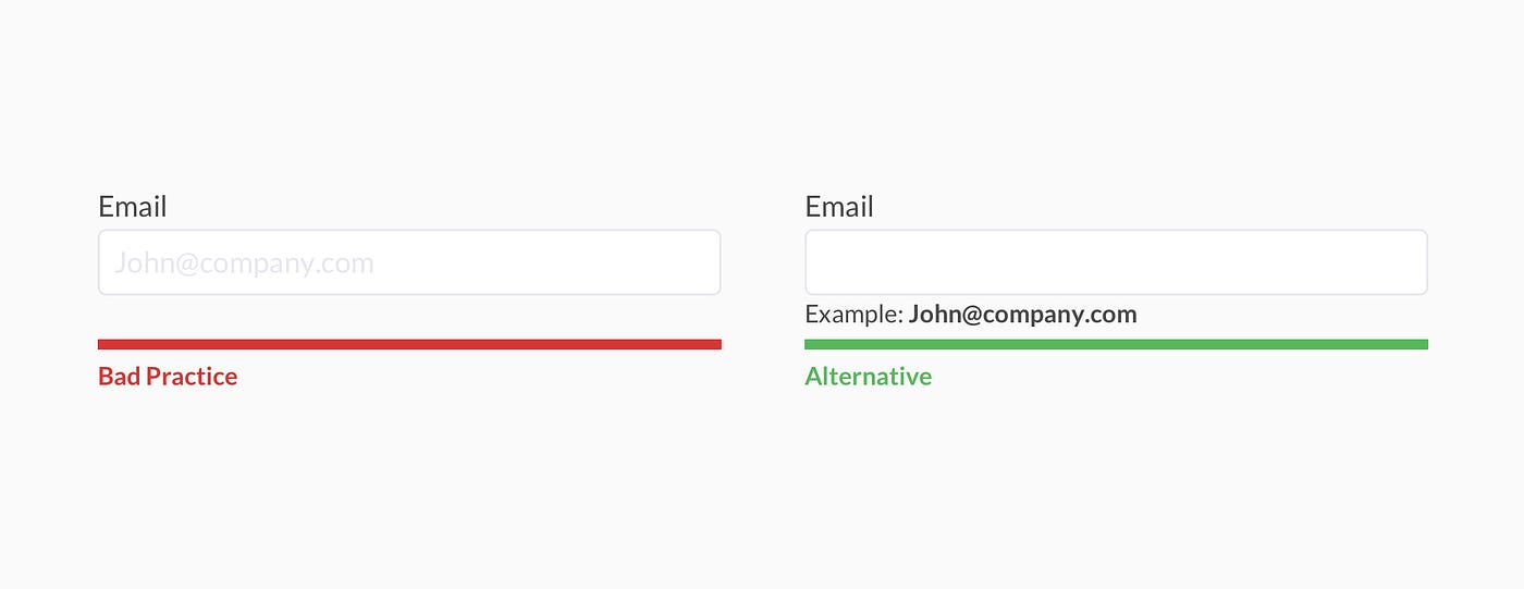
Labeling Forms Clearly
Use a clear visual label and not placeholder text. It’s harder for people with visual impairments to see and also strains short-term memory. The below image illustrates what we are describing.
Illustration
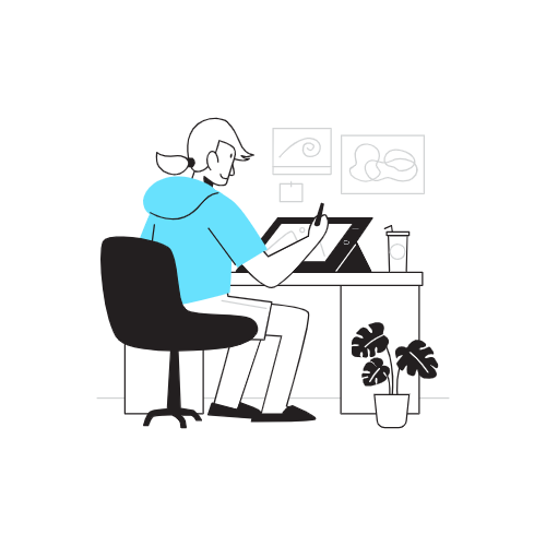
We’re almost at the end of our list, so let’s talk about illustration. This gives designers free reign and lets their creative juices flow. Just make sure the illustrations are relevant to the content. That’s a benefit of illustrations, they are extremely flexible and customizable since you’re pretty much starting from scratch. The world is your oyster, so take advantage of it. Illustrations also form a natural connection with visitors, and this will make your brand even more memorable.
Neumorphism
It’s a cool word, right? The idea came about when everyone was moving away from a concept called Skeuomorphism, which mimics real-world items, for example, the trash can icon on your desktop. Like skeuomorphism, neumorphism takes a minimalist approach, while giving a sense of dimension in elements. It’s aesthetically pleasing and gives texture to elements that may have otherwise been pretty underwhelming. The only challenge is accessibility since the color palettes are low contrast and it can be complicated to achieve visual hierarchy. But, hey what are designers for? Don’t be surprised if this concept evolves to meet the challenge of accessibility.
Fin
Well, there’s our list of 7 design practices that we love. Of course, there are others that could have made this list, these just seemed the most relevant right now. Let us know what you think of this list and other design practices that should have made it on our list.