
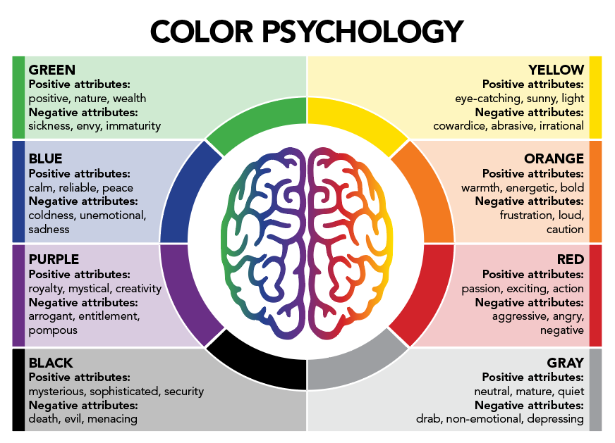
The use of color in branding can influence 85% of shoppers’s purchasing decisions. On top of that, it can also increase brand awareness by 80%. Why do you think companies like Coca-Cola, McDonald’s, and Starbucks have become so iconic? The colors not only catch the audience’s attention but contribute to the company’s reputation. Red makes you hungry, yellow evokes happiness, and green brings feelings of relaxation. The research on how color affects human behavior is called color psychology. A basic understanding of this concept can greatly improve your branding and marketing strategy.
Color is all around us so it’s not surprising that they can affect human behavior. So, it’s important to understand how the use of color in branding works so you can attract the right audience to your brand.
First Impressions Matter
Color can determine a consumer’s first impression of your brand. So, you should carefully consider if your color palette is the right one for your brand. To do this, you need to know your brand personality and your target audience. If you want your brand to identify as calm and reliable, you wouldn’t go with orange and red. You want your colors to support your brand’s personality because that’s how your brand will stand out from the rest.
Think About Your Target Audience
Remember to consider the audience that your brand is catering to. Study the demographics of your target audience, such as age and gender. Bold, bright colors may appeal more to a younger audience. Whereas a softer color palette often appeals to an older audience. Ultimately, you know your target audience the best so align your colors to focus on them and your business’s goals.
Look at Your Competitors
You want your brand to be recognizable, so it’s important to look at your competitors to make sure there’s some differentiation. For example, Coca-Cola and Pepsi both use red and white, but Pepsi to differentiate itself added blue to its color palette. You want your brand to stand out and color can be an important element to help with that.
Finding Your Palette
We won’t bore you with color theory, but it’s important to understand the basics of color combinations. There are complementary colors, analogous colors, triadic colors, and monochromatic colors.
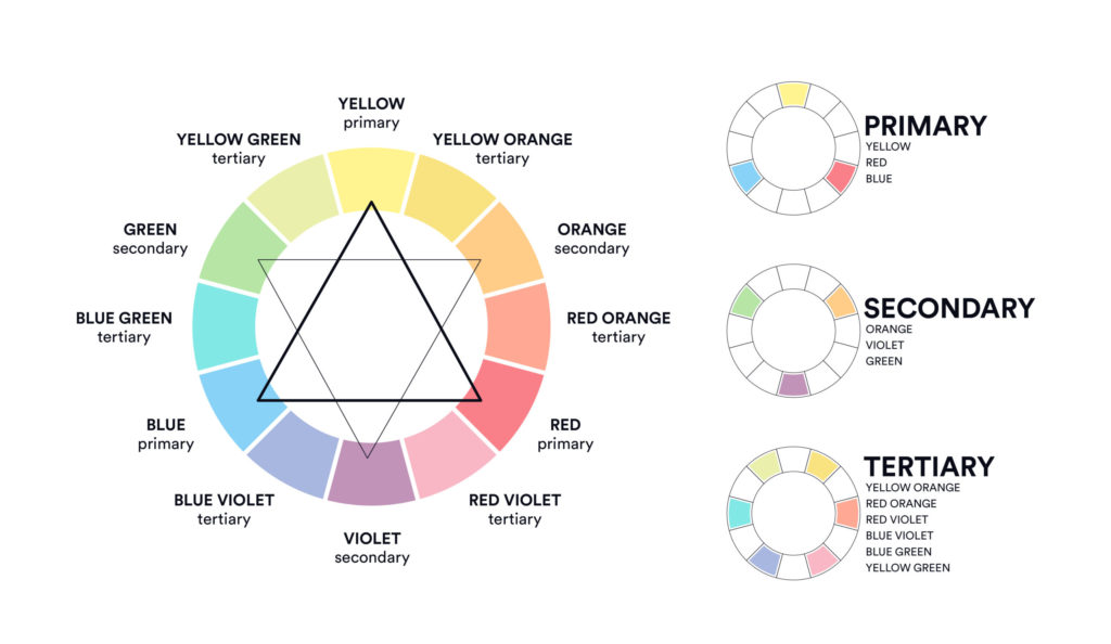
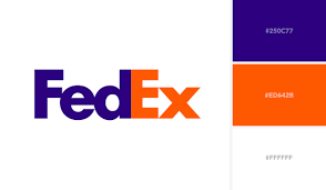
Complementary colors are opposites on the color wheel. This combination offers contrast and boldness. FexEx and Visa are examples of a complementary color palette.

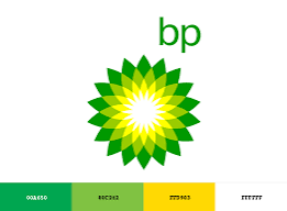
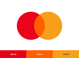
Analogous colors sit next to each other, usually, three colors are used. This combination is easy on the eyes and creates a cohesive look. BP and Mastercard are examples of an analogous color palette.
Triadic colors are evenly spaced around the color wheel. This combination creates a vibrant look. Burger King and Firefox are examples of a triad color palette.


Monochromatic colors are different shades and depths of the same hue. This combination creates a clean and minimalist look. Starbucks and Target are examples of a monochromatic color palette.


Here are some general rules when picking a color scheme for your brand. Plan to choose 3 colors: a base color, an accent color, and a neutral color. Your base color is your most dominant color, so it should appeal to your audience and reflect your brand’s personality. Your accent color must pair visually with your base color. Think of an accent color’s role as a supporting actor for the main star. And, then there’s the neutral color, which will most likely be a background color and shouldn’t be a distraction from the other colors. To make it easy for you remember the 60-30-10 rule. The base color uses 60% of the space, accent uses 30%, and neutral uses 10%.
Another rule is to make sure the colors you pick will show up well whether it’s online or in print. Some colors may look great digitally, but may not print well. You want your colors to be practical for all uses.
Free Resources
Conclusion
You know your brand and audience the best, so choose colors that align with your brand’s personality and your audience’s needs. Understanding the use of color in branding is an important element to consider during this process. Don’t overthink it, and remember to keep it simple. But if you would like more expertise on this subject, don’t hesitate to reach out to us.