
So, if there was a statistic out there that said people spend around 4 hours a day on their mobile devices, would that surprise you? Considering how mobile devices have created connections and a digital platform for people, it shouldn’t come as a huge surprise. But still, we would all agree that 4 hours is a lot of time to be spending on a mobile device. No judgment here, we’ve all been guilty of spending too much time on Instagram, having TikTok viral hits stuck in our heads, etc. Also, it can be an essential tool for work since many people are working from home now. Since so much time is spent on mobile devices, we thought it would be a good idea to talk about designing for mobile devices.
Why It Matters?
Nearly 80% of customers will stop engaging with content if it doesn’t display well on their device. That stat alone should convince you as to why designing for mobile matters. But if you’re not into numbers, consider your customer’s experience. You want it to be seamless, efficient, and friendly. So, your design must meet those needs if you want your customer to have an enjoyable experience that will keep them coming back for more. Since more customers are using their mobile devices to interact digitally, we must accommodate that.
What Makes a Good Mobile Site?
So, we talked about what makes a great website in a previous post of ours. But now we are just going to focus on crafting a beautiful and functional mobile site. Here are 5 principles to help you get started.
1. Prioritize information and create a hierarchy
There’s not much space to play with when it comes to mobile devices. So, it’s best to prioritize information that is vital for your customers. Mobile design should help visitors navigate the information in a quick and easy way.
Try out these steps when designing for mobile:
- Be selective about the information you display. All the information on your desktop site does not have to show up on your mobile site. Just go to your favorite website and compare the desktop site to the mobile one. There tends to be more specificity when it comes to mobile sites.
- Make call to actions obvious. Don’t get fancy here. Be intentional about call to actions and make sure they are legible and large enough to click on.
- Keep it simple. Focus on one column layouts to make the information easier to read. You don’t want to overwhelm your customers.
2. Visual consistency between mobile and desktop site
Using responsive design can solve most consistency issues. Since this layout changes based on the device being used. Make sure any styling changes are consistent across the board, so you don’t confuse your visitors. Follow your brand guideline if you have one, and if you don’t it might be a good idea to start thinking about one.
3. Placement of Buttons
This can often be overlooked since it doesn’t seem that big of a deal. But go ahead and grab your phone. Look where your thumb and try to touch every corner of your screen. Depending on the size of your screen this simple task may be more difficult. How did you do? You may have noticed that the bottom corners took minimal effort to reach. This is where you should place buttons on your site. Spotify is a good example. All the important controls are in easy reach for the thumb.

4. Keep it minimal
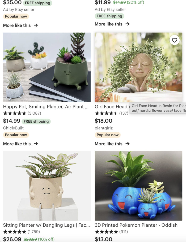
Easier than it sounds right? Well, if you need a visual let’s look at Etsy. It has simple navigation and utilizes different column layouts to separate the information. Only the most important information is up there which is the product and price.

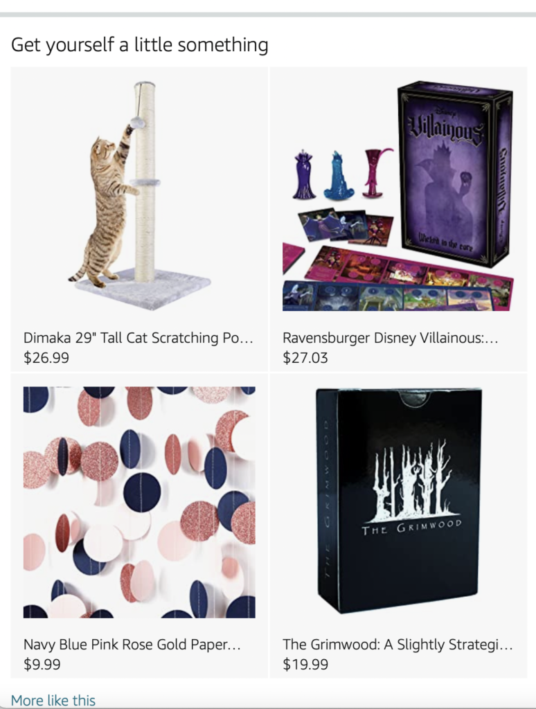
Amazon also does similar things, but it does utilize the infinite scroll. Meaning the page will go on and on and on with no end in sight. Not huge fans since It doesn’t give visitors any respite. Plus, this may slow down the visitor’s purchase decision since there are so many options available.
5. Readability
Make sure your text isn’t too large or too small on the screen. A good rule of thumb is 16 pixels for font size. You also want to make sure the fonts you are using are legible as well on a mobile screen. If you’re wondering what to do with headers, try it in all caps. It will be larger than all the other text on the page and will grab the viewer’s attention.
Conclusion
So, there you have it. 5 simple things you can do to enhance and elevate your mobile design. If you want more info on how to optimize your site for mobile devices, we would to chat with you here. It can get pretty complicated and overwhelming, so we would to be there for you along the way. Mobile design isn’t going anywhere and it’s just going to further advance to make the digital experience more enjoyable. Hope this helps you to elevate you and your business and your visitor’s experience as well.