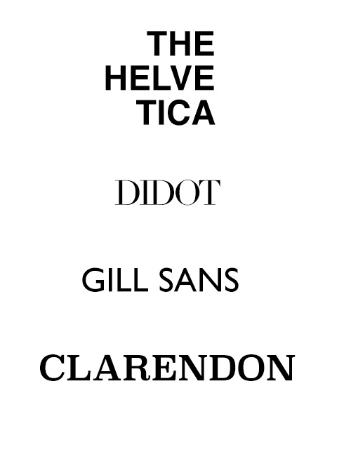
Looking at the image on the right, do any of the fonts remind you of any brands? The North Face, Zara, Tommy Hilfiger, Rolex? Most likely, you were able to connect some of the fonts to specific brands. Fonts can communicate your brand and help you stand out from your competitors. You didn’t think of Patagonia when you looked at Helvetica. Fonts are distinctive and if you’re consistent with them, people will associate a font with your brand. So, here are 5 reasons why they matter.
Fonts Have Personality
Yes, you read that right. They have personality and it’s crucial that you use the right one to express your brand. You wouldn’t use a script font if you’re going for a professional feel. Or a heavy, blocky font if you wanted a soft, delicate feel. Every font will communicate something different to your customers. That’s why it’s important to think about your font choice and if it connects to your brand.
Fonts Attract Attention
Choosing fonts that are easy to read will instantly attract attention. Just make sure to ideally use 2 when it comes to your brand. The reasoning behind this is that you want your customers to recognize your brand, especially if you’re selling products. You don’t want to confuse your customers by using too many. We’ve seen websites with at least 5 different fonts and that alone can be distracting. Even worse, visitors may think that they’re on a totally different website because of all the different fonts. You want them to attract attention, but not in this way.
Fonts Ensure Readability
Fonts impact the ability to read and gather information. That’s why it’s important to choose carefully, so your brand’s message is communicated effectively. Without diving too much into the vast world of typography, sans-serif fonts are generally the way to go for websites compared to serif fonts. But, what’s the difference? To make it simple, serifs are the small lines attached to letters. For example, Clarendon and Didot are serif fonts whereas Gill Sans and Helvetica are sans-serif fonts. An easy way to remember this is sans means without. Sans-serif fonts won’t have the small lines or ‘feet’. Ultimately, it’s all about balance and if you need help finding that balance, we would love to assist you.
Fonts Establish Hierarchy
Hierarchy is what guides the eyes of the audience. It dictates the audience’s attention when they’re reading the content on your website. You can do this by the size, weight, style, or placement of the font. Use specific fonts for the heading and body text. This will establish contrast and help the reader distinguish the information. If you’re having trouble, we would love to chat and help you out, contact us now.
Fonts Make an Impact
Along with communicating a message, fonts can also create a strong visual impact. If done right, you won’t even need other supporting visuals to effectively communicate your message. Typography can lead the design of your website and play both roles of utility and aesthetics. Don’t underestimate the proper use of typography because in our experience it can either make or break the overall design of your website as well as your brand.
Resources
Here are some great resources that we use when it comes to fonts:
Google Fonts have a massive library of downloadable, open-source, & free fonts. That means you can use them however you want without worrying about licenses.
Adobe Fonts is another great resource to browse and download fonts. The only downside is that you need a subscription to have access to it.
Font Squirrel is also a reliable tool for free fonts.


